Accessible publishing in practice
Over the past year, we at Crius Group have been working on accessible publishing (TPUB) and how it will affect our processes. E-books have always been a focal point for our company and we want to continue to guarantee the same quality and service even when new legislation comes in.


Jens Gilis
In our TPUB working group, we looked at what the key points of an accessible e-book were. In doing so, we felt it was important to keep the impact on workflow as minimal as possible. You can read how Crius Group handles this here!
Metadata
Metadata is one of the most important if not the most important element in an accessible e-book. It not only determines what is in your e-book, but even ensures that your e-book can be read at all! Therefore, it is absolutely necessary to start enriching our standard ePub2 files.
We indicate how accessible the e-book is, but also what languages are present, whether all images are described and so on. We read this metadata from the book's InDesign files.
Images and ALT text
And so we immediately touch on a second point. All images in your interior pages must be described in ALT text, with the exception of purely decorative elements.
Let us briefly explain what an ALT text is:
- Concise and informative language;
- Maximum 125 characters (short description);
- No details from the text and thus different from the caption;
- Does not contain URL links.
Structural differences
So you notice that structurally something has to change in e-books. To enable such metadata and ALT text, we are switching to a new format, ePUB3.
There will also be a clear HTML structure in the file. This will make it possible for software to correctly represent the e-book even without design. Thus, the descriptive CSS is largely eliminated. We implement these structural changes in the formatting of our files. This allows us to prepare our files for the switch in the background - without impact to the customer.
Navigation
There will also be more navigation options in the file, but of course traditional navigation will also remain. A digital, clickable copy of the table of contents will still be available. In this, the accessible e-book does not differ. The difference is in the new 'landmarks' and the page list.
The landmarks are key points in the book that come in a separate, clickable table of contents. This makes navigating the book much faster. Some of the points that come in this content include the beginning of the book text, the prologue and the beginning of the epilogue.
This functionality also adds value for researchers and students who get to the parts of the book they are looking for much faster and more clearly.
The page list is a literal list of page numbers. It corresponds to the folio book and serves mainly to show everyone the same content when referring to a particular page. This could have been a very laborious process, but because of our background in scripting, Crius Group was able to automate all of these navigation tools.
Contrast and use of color
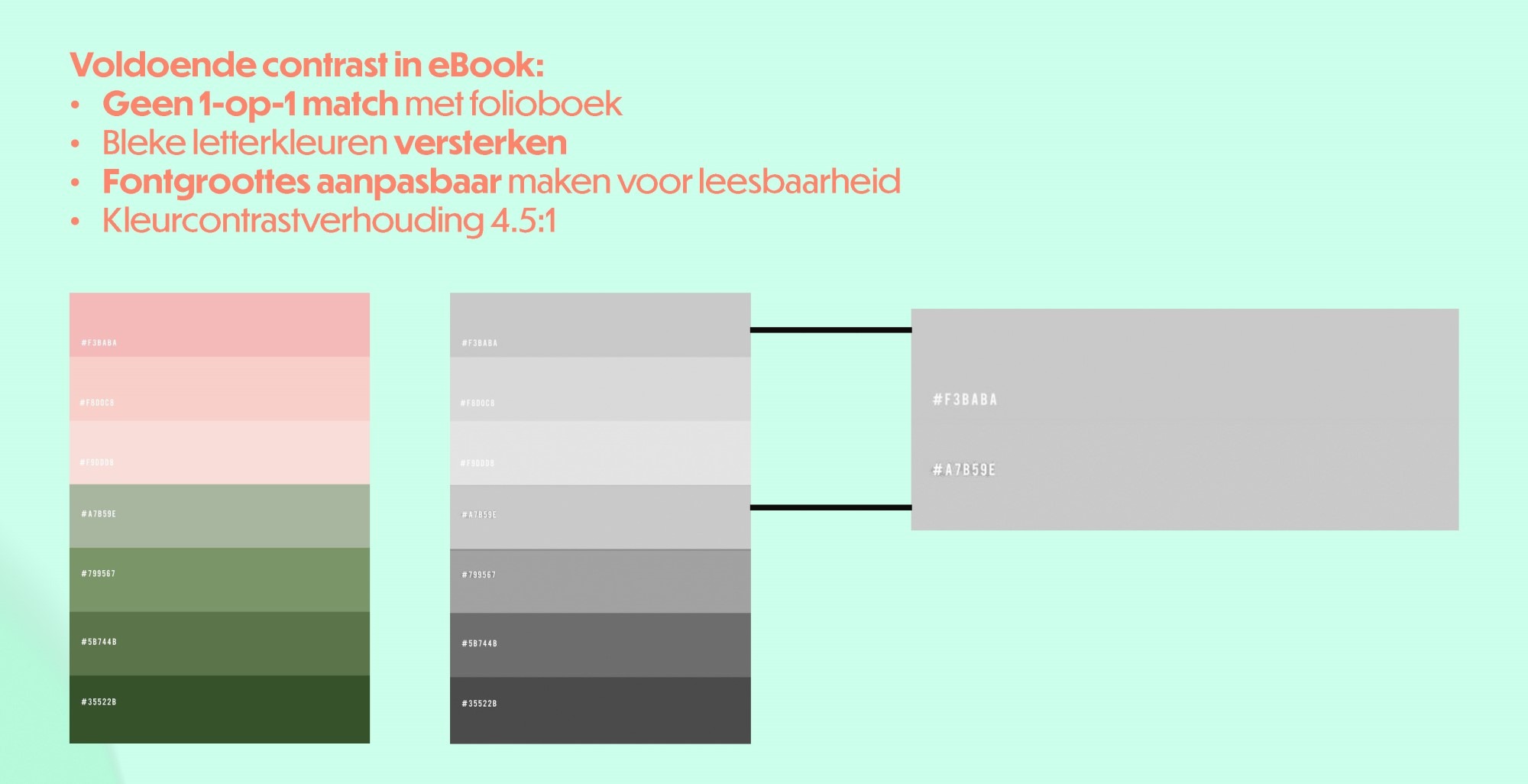
Contrast is another important issue within the new legislation. Gray backgrounds for frame text and formatted color images will have to meet the ratio of 4.5/1.
Specifically, this means that text on a gray background of 10% black must be 4.5 times darker (i.e., 45% black). This is a hard limit that cannot be deviated from and will change how we handle color.
We will always do a manual check on this since a folio book is not bound by this rule.

Validation
Last but not least, it is also important to indicate how we are going to validate all these extras. For now, while the legislature is waiting, we use international standards to test our e-books.
For example, we use EPUB checker and ACE by Daisy to obtain our validation. We are also in the midst of testing with publishers at home and abroad to meet their requirements as well. But more on that later.
TPUB session 35th anniversary
Want to know more? Check out the session given by colleague Jens Gilis during our 35th anniversary on this topic. 👉